Prev

Next

Improving Trust, Retention, and Conversion on Pricepally

Improving Trust, Retention, and Conversion on Pricepally

Redesigning a grocery e-commerce platform for a price-sensitive Nigerian market, from discovery to checkout.

I led the end-to-end redesign of Pricepally's shopping experience, fixing the friction that was quietly costing the business conversions, trust, and returning customers.

Redesigning a grocery e-commerce platform for a price-sensitive Nigerian market, from discovery to checkout.

I led the end-to-end redesign of Pricepally's shopping experience, fixing the friction that was quietly costing the business conversions, trust, and returning customers.

View Live Product

View Live Product

Company

Pricepally

Industry

E-commerce (Groceries)

Platforms

Web app, Mobile app

Role

Product Designer

Year

2025

Scope

Scope

End-to-end redesign of web and mobile shopping experience, covering product discovery, cart management, checkout flow, loyalty mechanics, and navigation, across both local and international store variants

End-to-end redesign of web and mobile shopping experience, covering product discovery, cart management, checkout flow, loyalty mechanics, and navigation, across both local and international store variants

Context & Opportunity

Context & Opportunity

Pricepally is a grocery e-commerce platform that owns its own inventory, controls pricing, and handles fulfillment. The model is clean on paper, no third-party sellers, no pricing noise, but the experience the product was delivering told a different story.

By the time I got deep into this work, the platform had grown. More SKUs, more store variants, more customers. But the interface hadn't kept up. What was manageable at a smaller scale became genuinely confusing at a larger one.

The gap wasn't the product. The gap was the experience around it.

Users were landing on a platform where they couldn't easily find what they were looking for, couldn't trust the pricing they were seeing, and didn't understand what they were getting before they checked out. For a grocery platform competing in a price-sensitive market, that's not a minor inconvenience. That's a revenue problem.

Pricepally is a grocery e-commerce platform that owns its own inventory, controls pricing, and handles fulfillment. The model is clean on paper, no third-party sellers, no pricing noise but the experience the product was delivering told a different story.

By the time I got deep into this work, the platform had grown. More SKUs, more store variants, more customers. But the interface hadn't kept up. What was manageable at a smaller scale became genuinely confusing at a larger one.

The gap wasn't the product. The gap was the experience around it.

Users were landing on a platform where they couldn't easily find what they were looking for, couldn't trust the pricing they were seeing, and didn't understand what they were getting before they checked out. For a grocery platform competing in a price-sensitive market, that's not a minor inconvenience. That's a revenue problem.

PricePally Before The Redesign

Discovery (Research & Insights)

Before I touched a frame, I needed to understand where the experience was actually breaking down and why.


I ran a combination of user interviews, session recordings, drop-off analysis, and a competitive teardown across Nigerian grocery e-commerce alternatives. Here's what the research surfaced:

Method

What I Learned

How It Shaped the Design

User interviews (18 sessions)

Users described a "bait-and-switch" feeling, prices shown on product pages didn't match what they saw at checkout, and they rarely completed a purchase after that moment

What actually happened was that product price changed after a long time in cart, made pricing transparent at the product detail level, and nudge users at price fluctuation even at cart level

Session recording review

Cart abandonment wasn't happening at checkout, it was happening when users returned to a session and found their cart empty or changed

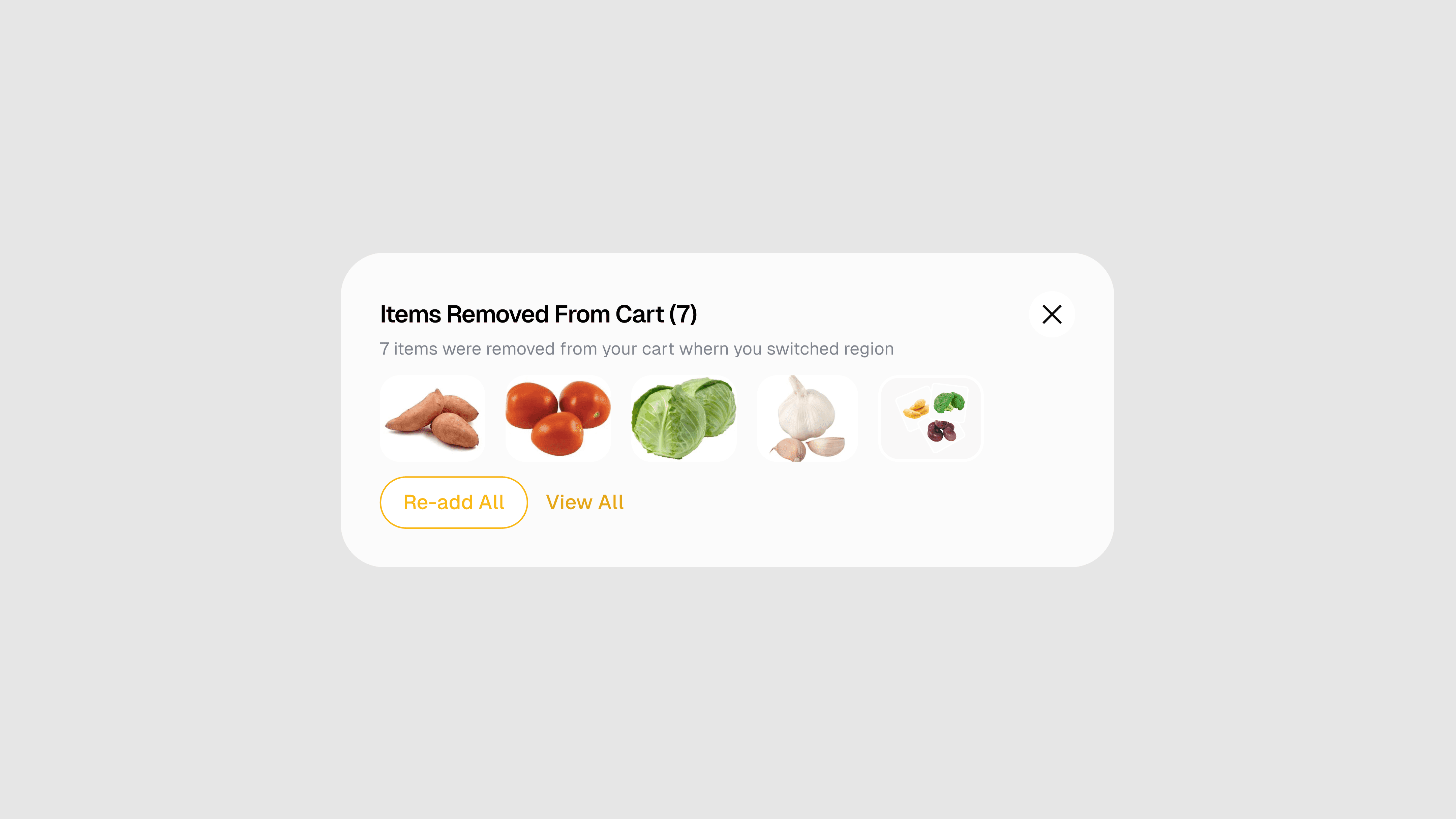
What happened is that when users switch regions to a region that some items are not available or has different pricing, it drops from their cart due to technical limitation without any notification, I designed a nudge with an option for users to add them back when they revisit a region that has those items.

Drop-off funnel analysis

40% of users who reached checkout were abandoning before payment, higher than category benchmarks

Stripped checkout to minimum steps; kept order summary visible throughout

Competitive teardown

Competitors either had rich catalogues with poor pricing clarity, or simple experiences with limited range, no one was doing both well

Positioned Pricepally's own-inventory model as a trust advantage and made it visible in the UI

Navigation behaviour

Users couldn't distinguish between the local and international stores, they were browsing one, landing on items from the other, and getting confused by the price differences

Redesigned store switching to be explicit and persistent, not contextual
The insight that anchored everything: Users weren't abandoning because they didn't want the product. They were abandoning because at multiple points in the journey, something happened that made them feel like they couldn't trust what they were seeing. That's a different problem from "the UI is unclear." It's a credibility problem and it required a different kind of solution.

What I Was Solving

What I Was Solving

Shopping on Pricepally should have felt simple. You find what you need, you add it, you pay, it arrives. But across the journey, there were real points where users hesitated, got confused, or dropped off entirely.

The questions that kept surfacing from users and from the data were things like:

  • Why does this item show one price here and a different price at checkout?

  • I added things to my cart yesterday. Where did they go?

  • What's the difference between the local store and the international store?

  • I don't know what I'm getting until I've already committed.

  • Why is it so hard to just reorder what I bought last time?

And underneath all of those: do I trust this enough to put in my card details?

That was the real problem. Not any single flow in isolation. The platform had accumulated friction in enough places that it was eroding confidence especially for first-time users who had no prior relationship with the brand to fall back on.

Shopping on Pricepally should have felt simple. You find what you need, you add it, you pay, it arrives. But across the journey, there were real points where users hesitated, got confused, or dropped off entirely.

The questions that kept surfacing from users and from the data, were things like:

  • Why does this item show one price here and a different price at checkout?

  • I added things to my cart yesterday. Where did they go?

  • What's the difference between the local store and the international store?

  • I don't know what I'm getting until I've already committed.

  • Why is it so hard to just reorder what I bought last time?

And underneath all of those: do I trust this enough to put in my card details?

That was the real problem. Not any single flow in isolation. The platform had accumulated friction in enough places that it was eroding confidence, especially for first-time users who had no prior relationship with the brand to fall back on.

International store Homepage

International store Homepage

International store Homepage

What I Focused On First

What I Focused On First

Pricepally could have benefited from redesigns across dozens of touchpoints. That's not where I started.

I focused first on the moments that were doing the most damage: the places where users were actively deciding to leave or deciding to stay.

That meant:

  • clarifying how products were presented and priced before users got to cart

  • fixing the cart experience so it felt stable and trustworthy, not unpredictable

  • simplifying checkout to remove every unnecessary step and source of confusion

  • making navigation across store types intuitive, not something users had to decode

  • designing a mobile experience that matched how most people were actually shopping

I also looked at the longer arc, what would bring someone back a second time? That's where loyalty, gamification, and customizable lists came in. But the foundation had to come first.

I also looked at the longer arc, what would bring someone back a second time? That's where loyalty, gamification, and customizable lists came in. But the foundation had to come first.

Key Decisions & Trade-offs

Decision

Rationale

What We Rejected & Why

Pre-switch cart conflict warning + dropped item recovery

Pricepally operates across multiple regional stores (Lagos, Abuja, Ibadan, Port Harcourt) each with its own inventory and pricing. A backend constraint meant that switching regions didn't just change what was visible; it invalidated any cart items unavailable in the new region. Items that existed in a Lagos cart but weren't stocked in Ibadan would be silently dropped and critically, they wouldn't return even if the user switched back. This was causing cart loss that users had no warning about and no way to recover from. Rather than hiding the constraint or letting the silent drop continue, I designed two interventions: a pre-switch warning modal that clearly told users their cart might be affected before they confirmed the region change, and a post-switch recovery state that surfaced any dropped items with a one-tap option to re-add them once back in the original region. The decision was to treat the backend constraint as a user experience problem, not an engineering footnote and give users both the information to make an informed choice and the tools to recover if items were lost.

Silently dropping cart items and doing nothing was the existing behaviour, technically the path of least resistance. An alternative was to freeze the cart and prevent region switching entirely, but that would have blocked a legitimate and frequent user need. The warning + recovery pattern respected both the backend reality and the user's right to understand what was happening to their basket.

Separate store switching, not blended browsing

Users needed to know which store they were in. Mixing local and international items created pricing confusion that was eroding trust.

A blended catalogue felt more "modern" and allowed richer cross-selling, but the confusion it caused outweighed the discovery benefit

Persistent order summary during checkout

Removing the order summary during payment increased user anxiety. Keeping it visible throughout let users stay oriented and reduced second-guessing

A collapsed summary is standard in many checkout flows and saves screen space, but our user interviews showed it made Pricepally's users nervous

Loyalty as layer, not a separate destination

Embedding loyalty signals (points, milestones) within the shopping flow rather than behind a dedicated loyalty tab meant users encountered it naturally rather than having to seek it out

A standalone loyalty hub is common and easier to build, but users who never navigated to it never engaged with it

Customisable recurring lists

For a grocery platform, repeat behaviour is the business. Lists that persist and can be reactivated in one tap directly reduced the friction of re-purchasing

Recommendation-only return mechanics (like "buy again") require less user setup, but they hand control to the algorithm rather than the user, which grocery shoppers don't always trust

What I Designed

What I Designed

1. Product Discovery & Homepage

The homepage was doing too many things at once. Two store variants (local and international) were presented in a way that confused users about which one applied to them. Promotions and featured items competed for attention without clear hierarchy.

I restructured the entry experience to give users a clearer sense of where they were and what was available to them. The local and international store variants became easier to understand and navigate between. Featured products were given proper visual weight, and discovery pathways, categories, search, recommendations were made more direct.

The goal was simple: land on the page, know where you are, find what you need.

Local store Homepage - Default View

All products page

Adding products with multiple variant to cart

2. Product Detail & Pricing Clarity

Pricing had become a source of confusion. The platform had valid business reasons for how it structured costs, bulk pricing, delivery fees, quantity tiers, but those reasons weren't being communicated in a way users could follow.

I redesigned the product detail experience to surface pricing information in a way that felt honest rather than surprising. Unit pricing, quantity options, and total cost estimates were made visible before the user committed to adding anything to cart. Availability states in stock, low stock, out of stock were also made explicit at the product level rather than appearing only at checkout.

Users shouldn't have to get to the last step to find out if something is even available..

Product details page

Shopping mode

Customizable bundles

Bundles details page

Local store Homepage - Default View

Product details page

3. Cart Management

The cart was a particular problem. Users would build a basket, step away, come back and find things had changed or disappeared. Recommendations were absent. There was no structure to help users feel like the cart was a reliable holding space.

I redesigned the cart to feel more stable. Saved items, clear quantity controls, visible pricing summaries, and contextual recommendations (based on what was already in the cart) gave users more confidence that their choices were being held and that the total they were seeing was the total they'd pay.

I also introduced the foundation for customizable lists a way for returning users to save recurring grocery orders and reactivate them without rebuilding from scratch each time. For a grocery platform, repeat purchasing is the whole game. This was a meaningful step toward making that easier.

Adding products with multiple variant to cart

Cart system, showing items dropped and recommendations

List creation

Adding items to list

Items added to list

Manage list Page

4. Checkout Flow

Checkout abandonment was sitting at 40% before the redesign. That number tells you there's a specific moment or a series of moments where users are deciding the effort isn't worth it.

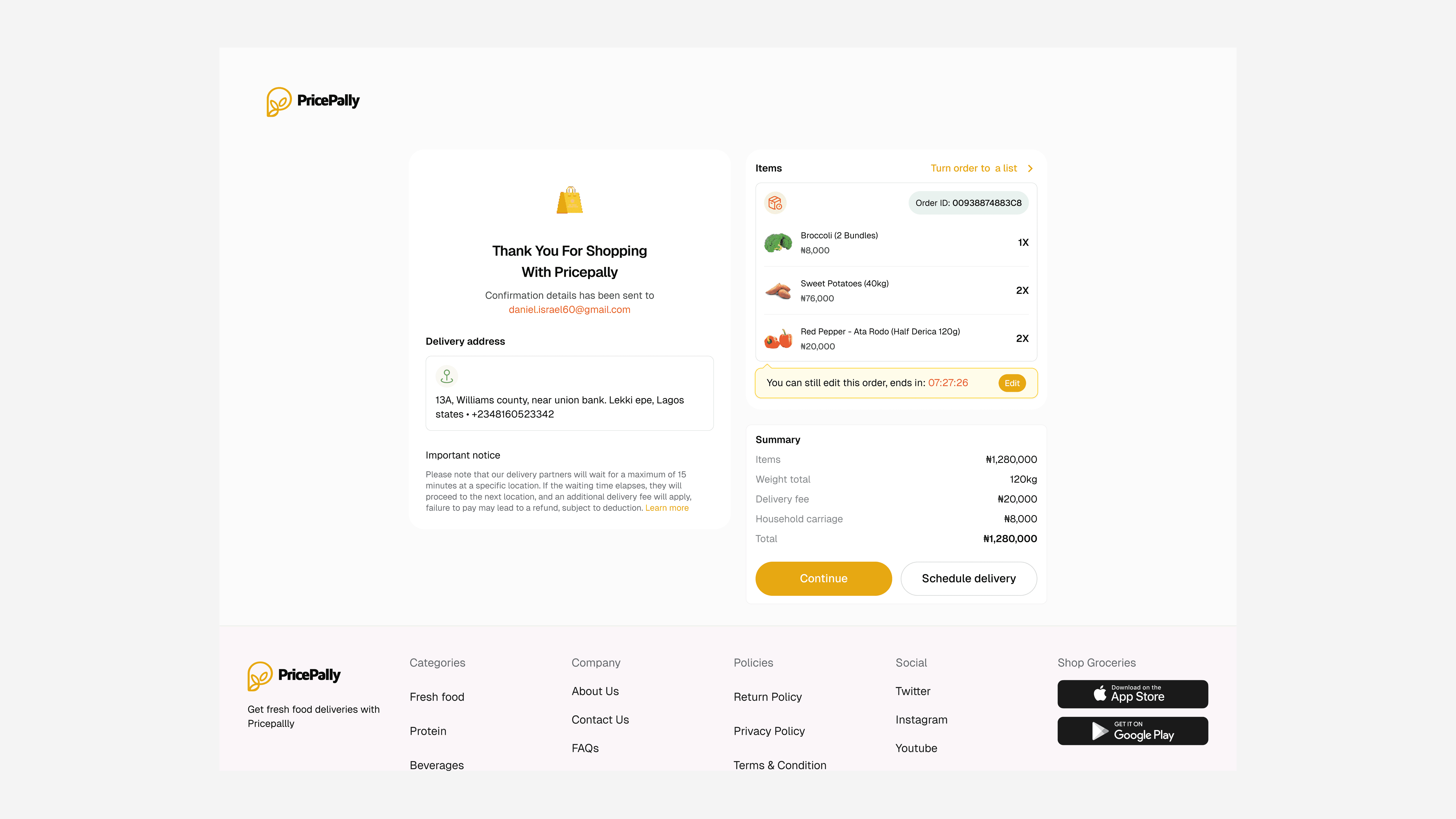
I stripped the checkout flow back to its essential steps and removed every point of unnecessary decision-making. Payment options were made clearer. Delivery details were easier to complete. The order summary stayed visible throughout, so users never had to guess what they were about to pay.

The redesigned flow reduced abandonment from 40% to 15%.

Checkout page

Checkout page

Payment screen

Success screen

Shopping mode

Customizable bundles

Cart system, showing items dropped and recommendations

Bundles details page

5. Loyalty & Gamification

Once the core experience was cleaner, I looked at what would give users a reason to come back.

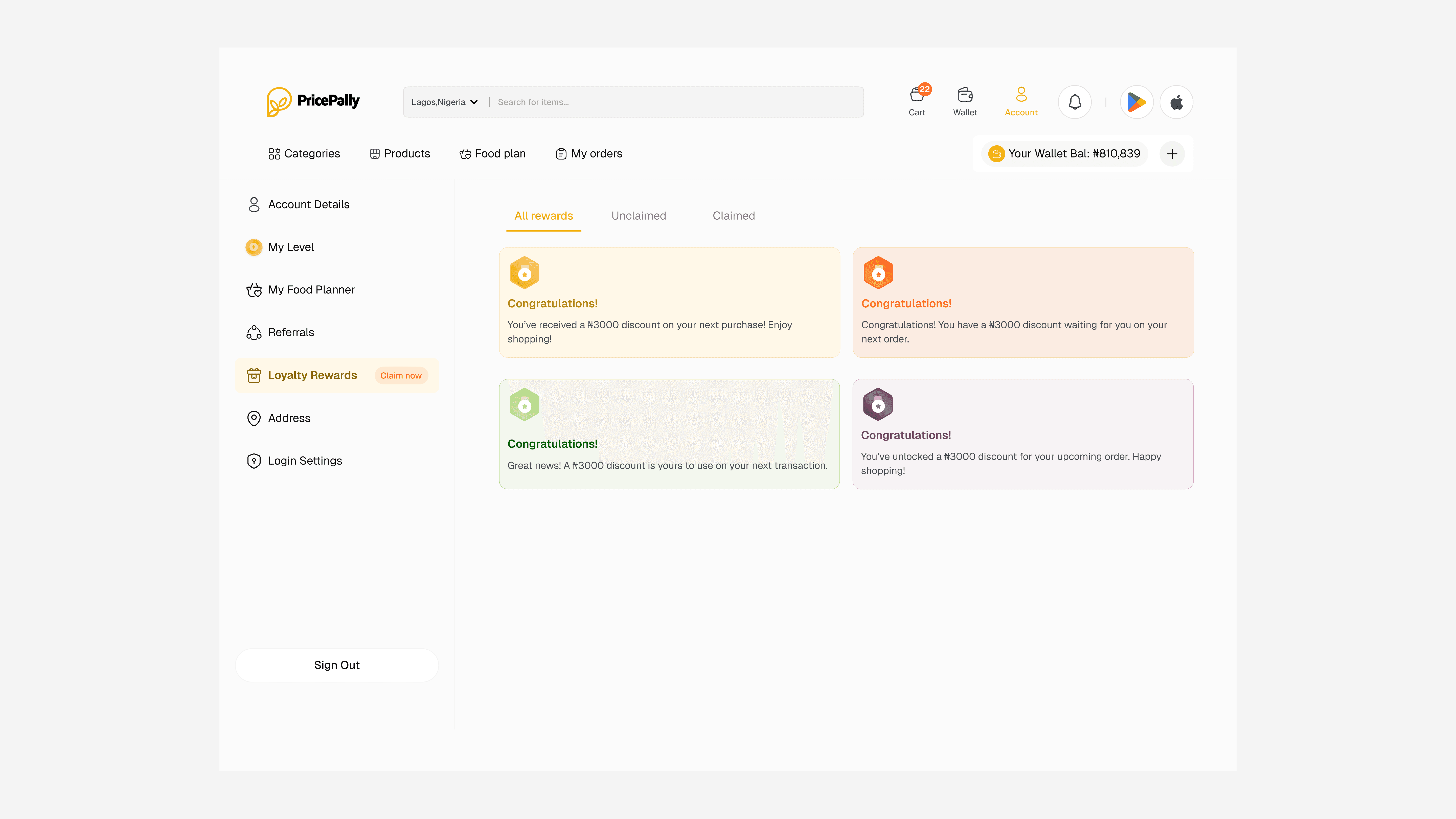
I introduced a loyalty layer points, purchase milestones, and rewards tied to shopping behaviour that gave returning customers a sense of progress and a reason to keep their purchases on Pricepally rather than spreading them across alternatives. The gamification elements were designed to feel natural to the shopping experience, not bolted on.

List creation

Level based gamification

Earning details

Referral dashboard

Loyalty reward dashboard

Adding items to list

Items added to list

Checkout page

Manage list Page

Checkout page

Payment screen

Level based gamification

Success screen

All product page

6. Mobile Application

Even though the web was a major traffic source, data showed that 40% of Pricepally's users were shopping on mobile. That meant the mobile app wasn't a secondary concern, it was where the most of the experience actually lived.

After completing the web redesign, I moved directly into mobile with the same priorities: find what you need, understand what you're getting, complete the purchase without friction. On a smaller screen, every decision about hierarchy, tap targets, and information density matters more. I made sure the mobile experience didn't just mirror the web design, it was built for how people actually use their phones to shop.


Key mobile-specific decisions:

  • Bottom-anchored primary actions — add to cart, checkout, and payment CTAs were placed within natural thumb reach, not at the top of the screen

  • Simplified navigation — the local/international store switch that required education on web was handled with a persistent, clearly labelled toggle on mobile

  • Collapsed pricing detail — full pricing breakdowns were available but not the default view; the headline price was shown first, with detail one tap away

  • Streamlined cart review — the mobile cart was optimised for quick review and edit, not discovery; recommendations were secondary to confirmation

Product details page

Bundles details page

Local store Homepage - Default view

Shopping mode

Earning details

Referral dashboard

Loyalty reward dashboard

Customizable bundles

Adding products with multiple variant to cart

List creation

Adding items to list

Items added to list

Checkout page

Manage list Page

Checkout page

Payment screen

Level based gamification

Success screen

Earning details

Referral dashboard

Loyalty reward dashboard

Cart system, showing items dropped and recommendations

All product page

Swipe images to view mobile designs

Swipe images to view mobile designs

Impact

Business Metrics

Metric

Before

After

Change

Checkout abandonment rate

40%

15%

−25 pp

Conversion rate

Baseline

—

+45%

User retention (3 months)

Baseline

—

+35%

Session duration

Baseline

—

+20%

User satisfaction (survey)

—

90% preferred redesign

—

What the Numbers Mean

The checkout abandonment drop from 40% to 15% was the most direct signal that the pricing transparency work had landed. Users were no longer being surprised at the point of payment and when they weren't surprised, they completed the purchase.

The retention increase wasn't just from the loyalty layer. It came from the combination of a more trustworthy cart experience and the customisable lists feature, which gave users a reason to return that was personal to their shopping habits rather than just points-driven.

The session duration increase told a different story, users were spending more time on the platform not because it was harder to use, but because they were browsing more confidently. Confusion had been replaced with exploration.

NOW

15:44:34

Book intro call

2026 Daniel Israel • All Rights Reserved

Book intro call

NOW

15:44:34

ELSEWHERE

GitHub

2026 Daniel Israel • All Rights Reserved